

Walk into any county commission meeting and you’ll hear the same questions from residents—asked politely, asked urgently, sometimes asked angrily: Where is our money going? Why did this project cost so much? Who got the contract? Why did my property tax go up when the county says the millage stayed flat?
These are fair questions. They’re the questions a self-governing people should ask. And too often, the answers are buried in PDFs, spread across departmental spreadsheets, locked in accounting systems the public can’t access, or explained only during a two-minute public comment window after a 4-hour meeting. That’s not accountability—it’s a maze.
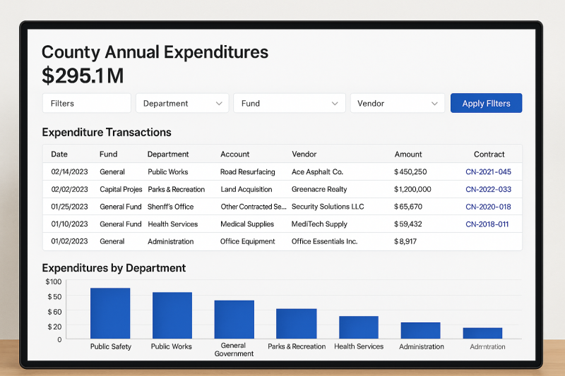
There’s a better model: a public, real-time, line-item spending dashboard where any taxpayer can see every dollar in and every dollar out—by fund, department, program, project, vendor, date, and account code—searchable on a phone in less than 30 seconds. Not summarized. Not spun. Not delayed six months. Line by line.
This article lays out the case for why every county should stand up a true transparency portal, what it must include to actually matter, how to launch one without blowing up staff workload or the budget, and how a dashboard changes behavior—from the budget office to the procurement desk to the commission dais—by putting sunlight on every transaction. If you care about protecting essential services and protecting taxpayers, this is the single most constructive reform you can push at the local level this year.
The Transparency Gap (and Why It Costs Real Money)
Most counties already publish something: an adopted budget, a CAFR/ACFR, a quarterly report, a procurement page with “awarded contracts.” Good. But those documents speak government; residents speak real life.
- A 350-page PDF isn’t “transparent” if you can’t search where the parks department spent its travel budget last quarter.
- A chart showing “Public Safety: $86.2M” doesn’t tell you whether overtime patterns suggest staffing misalignment, whether a particular vendor’s prices spiked, or whether grant funds supplanted local dollars (instead of supplementing them).
- A list of “awarded bids” without vendor payments conceals change orders, emergency purchases, sole-source buys, and the long tail of maintenance contracts that quietly balloon over time.
That gap between what’s technically public and what’s practically accessible is where waste hides, where special favors flourish, and where distrust grows. And distrust is expensive. It shows up as failed referendums, delayed capital projects, adversarial public meetings, and political churn that interrupts long-term planning. Transparency is not a talking point; it’s a governance tool that lowers the cost of being a county.
What a Line-Item Dashboard Actually Means
When we say “line-item,” we mean every single expenditure and revenue transaction, posted at least monthly (ideally weekly or nightly), with the following fields:
- Date of transaction and posting
- Fund (general, enterprise, special revenue, capital, grants)
- Department/Division/Program hierarchy
- Project/Grant identifiers (CIP number, award number)
- Account code and plain-language description (e.g., “531.34 – Other Contracted Services”)
- Vendor legal name and unique vendor ID (to reconcile across years and spellings)
- Payment amount (gross), check/ACH number, and cumulative fiscal-year-to-date to vendor
- Contract link (if applicable), purchase order number, solicitation type (IFB/RFP/sole source/emergency), and the contract ceiling with amounts obligated to date
- Memo/description as recorded in the ERP (scrubbed only for lawful privacy redactions)
- User-friendly tags (e.g., “road resurfacing,” “stormwater,” “school resource officer”)
- Geographic tag if relevant (commission district, zip, coordinate for project)
And for the revenue side:
- Source (ad valorem, sales surtax, franchise fees, impact fees, grants)
- Date, amount, fund, restriction/strings (e.g., restricted to transit), and variance against budgeted monthly curve
The public should be able to search, filter, sort, export to CSV, and view trend charts by department, vendor, tag, and project. No accounts locked behind a portal. No registrations required. No “email us a request and we’ll send it next month.”
Five Big Reasons This Should Be Non-Negotiable
1) It earns trust—before you ask for anything.
When residents can follow a tax dollar from levy to line-item, they start from trust, not suspicion. Trust is the cheapest capital a county can raise. It makes bond approvals easier, emergency appropriations faster, and collective projects possible.
2) It disciplines spending—without a single new rule.
People behave differently when they know their spending is visible in context. A recurring subscription that survived five budget cycles simply because “that’s what we’ve always used” starts getting hard questions—from staff themselves. Visibility triggers self-correction.
3) It deters favoritism—quietly and effectively.
When vendor histories are one click away—total paid, contract ceilings, change orders, and whether bids were competitive—procurement becomes more competitive by default. “Friends and family” deals hate search boxes.
4) It helps good departments prove value.
Transparency doesn’t just catch waste; it showcases excellence. Parks that stretch dollars, a sheriff who reins in overtime through smarter scheduling, a public works team that beats its CIP curves—when the data is visible, high performers finally get credit.
5) It accelerates continuous improvement.
Once transactions are standardized, you can analyze unit costs, compare like to like across departments, benchmark against peer counties, and identify savings that don’t cut essential services. A public dashboard is step one toward data-driven management.
“But Won’t This Be a Ton of Work?” (Short Answer: Not if You Build It Right.)
The heavy lift isn’t hand-typing lines for the public. It’s setting automated extracts from your existing ERP/financial system to a public data store on a schedule—nightly or weekly—plus a lightweight front-end that queries that store.
A practical architecture looks like this:
- Source: Your ERP (Tyler, Munis, Oracle, Workday, SAP, etc.).
- ETL: A scheduled job (SSIS, Pentaho, FME, or even a Python script) that:
- maps account codes to plain English,
- enforces field consistency,
- flags sensitive fields for redaction, and
- writes to a public database (PostgreSQL, MS SQL) or an open-data platform.
- Hosting: County-controlled cloud (Azure/AWS/GCP) or your open-data portal.
- Front-End: A web UI (React/Vue/Vanilla JS) with fast search, filters, and CSV export; ADA compliant.
- Governance: A redaction policy (below), data dictionary, and change-log page showing last update.
For many counties, this is a 8–12 week project with one analyst, one IT lead, a privacy review, and a lightweight vendor or civic-tech partner—not a million-dollar transformation. Start small, publish fast, iterate.
Redaction, Privacy, and Safety: A Clear, Strict Policy
Transparency is not an excuse to dox residents or expose legitimate security details. A county dashboard must proactively protect:
- Personally Identifiable Information (PII) of residents and employees: SSNs, full bank numbers, personal addresses when not business-related, medical details, etc.
- Domestic violence and safety-sensitive purchases (e.g., locations of shelters).
- Legally restricted data (HIPAA, CJIS, FERPA contexts).
How to do it right:
- Redact at the field level in the ETL—not ad hoc—so the policy is machine-enforced.
- Replace sensitive details with clear placeholders (e.g., “REDACTED – DV Shelter”).
- Publish the redaction policy on the dashboard so the public knows what’s withheld and why.
- Keep an audit trail of redactions to ensure consistency.
Done correctly, 98%+ of line-items can be published as-is. The 2% exception rate should be tightly defined and consistently applied.
The Minimum Viable Transparency (MVT) Checklist
If you launch nothing else, launch this:
- Monthly transaction export (expenses and revenues) within 15 days of month-end.
- Five essentials: date, amount, vendor, department, account description.
- Vendor roll-up: total paid year-to-date and prior year for comparison.
- Contracts linkage: each payment linked to a contract/PO page showing ceiling vs. spent.
- CSV download for any filtered view.
- Plain-language dictionary of accounts and funds.
- Update banner: “Last updated: [date/time]. Next scheduled update: [date].”
- Public feedback button: “See an error? Ask a question.” (Route to finance@county.gov with a 72-hour response SLA.)
That’s your v1. It will already be more transparency than most counties offer.
Leveling Up: From Transparency to Insight
Once v1 is live and stable, add these layers:
- Budget vs. Actuals: Monthly burn charts for each department/program with on-track/overrun signals.
- Capital Projects Tracker: Gantt-style view of project milestones; committed vs. remaining; vendor payouts; change orders.
- Grant Transparency: Start/end dates, matching requirements, supplant vs. supplement notes, performance measures.
- Procurement Pipeline: Upcoming bids, current solicitations, award timelines, protest window, and awarded scoresheets.
- Unit Costs and KPIs: Examples—cost per lane-mile resurfaced, cost per 911 call dispatched, cost per ton of debris collected.
- Geography: Map spend by district (for district-equity discussions) and by facility footprint.
- Open API: Let civic groups, journalists, and universities build their own visualizations.
Insight follows transparency the way sunrise follows the dawn.
How Dashboards Change the Budget Conversation
Picture next year’s budget workshop. Instead of debating line-items that few have actually tracked since last year’s adoption, commissioners and staff arrive with shared facts:
- “Travel” isn’t a vague suspicion; it’s a sorted table by department with totals, trendlines, and per-employee averages.
- “Consultants” are not a line on a slide; they’re discrete contracts with scopes, deliverables, and to-date payments.
- “Public safety overtime” is no longer an annual shrug; it’s 36 months of data by station, watch, and unit, with peaks tied to staffing patterns and special events.
The question shifts from “Can we afford this?” to “Is this the best way to achieve the goal?” That’s a healthier, more adult conversation—and usually a cheaper one.
The Property-Tax Reality Check: Assessments, Crept Spend, and the Dashboard Fix
Residents feel pressure not only from millage rates but also from assessed value growth and from creeping baseline spend that outpaces population plus inflation. A dashboard makes the drivers visible:
- Assessments vs. Levy: Show how total levy changed due to assessment growth even when the rate was “held flat.”
- Population + Inflation Benchmark: Publish a simple chart comparing county operating spend growth to the combined growth of population and CPI over 5–10 years. If spend repeatedly outstrips that benchmark, ask why and where.
- Structural vs. One-Time: Separate recurring operating additions from one-time capital or grant-funded bursts, so the public sees what will persist on next year’s bill.
- Mandates vs. Choices: Tag line-items as state/federal mandates versus discretionary policy choices. Voters deserve to see the difference.
With these visualizations, it becomes possible to lower the curve without cutting bone, by attacking bloat and misalignment rather than services.
Vendor Competition: Sunlight Is a Silent Bidder
Vendors pay attention to jurisdictions that publish clear histories. A transparent county signals predictability, fair dealing, and faster payments. That attracts more bidders, which lowers prices. It also discourages the “special-relationship premium” that thrives in darkness.
To harness the effect:
- Publish vendor scorecards after awards—price, qualifications, performance—so future bidders know how to win.
- Show total lifetime payments to each vendor across departments; break up unnecessary single-vendor dependency where possible.
- Standardize contract closeout data, so “on time/on budget” becomes a tracked metric, not a slogan.
You don’t have to write a single new procurement rule to get better deals; you just have to make the market see what you see.
“But We’ll Be Criticized for Every Purchase.” Good.
Accountability isn’t a hazard; it’s the job. The goal isn’t to avoid criticism—it’s to deserve less of it over time. A dashboard speeds that up by making waste obvious, but it also provides context that a rumor never does. When a travel expense is clearly tied to a grant-funded training that unlocks millions in federal dollars, the talking point evaporates. When an equipment purchase replaces repeated repair bills that were already visible on the dashboard, the public sees prudence, not extravagance.
Transparency doesn’t just invite criticism; it arms you with the facts to answer it.
The Culture Shift Inside the County
Here’s what staff routinely report once a line-item dashboard is live:
- Better requisitions. Knowing that memo fields will be public, employees write clearer descriptions and attach relevant docs from the start.
- Cleaner chart-of-accounts. Sloppy coding declines, because miscoding becomes visible to peers and managers.
- Faster close. Standardized ETL routines and data validation reduce month-end scrambles and audit findings.
- Smarter trade-offs. With unit costs posted, departments learn from each other (e.g., how utilities reduced leak losses or public works cut asphalt waste).
- Higher morale. High performers appreciate being able to point to results in real data, not just in anecdotes.
Good public servants like working in the sunlight; it validates their calling.
Cost, Staffing, and Sustainability
Let’s be candid: there’s a cost to doing this right, but it’s modest and it pays for itself.
- One-time build: Mapping fields, writing the ETL, privacy review, and building the UI.
- Ongoing: Keeping the feed running and answering public questions (which decline as the dashboard answers most of them).
To fund it without drama:
- Use procurement modernization funds, ARPA administrative set-asides (if still available locally), or modest overhead allocations charged to grants (where allowable, because transparency strengthens compliance).
- Partner with a local university civic-tech lab for initial build; many seek exactly these real-world projects.
- Start with MVT (above), launch in weeks, and expand features over quarters.
The ROI shows up as avoided mistakes, tighter contracts, fewer appeals, faster budgets, and higher public trust—each of which has a dollar value, whether or not it has a line in the general ledger.
Governance: Who Owns This?
Assign clear ownership and guardrails:
- Executive Sponsor: County Administrator/Manager (accountability and priority).
- Data Owner: Budget/Finance Director (data quality, dictionary, redaction policy).
- Technical Owner: CIO/IT (hosting, uptime, security, ADA).
- Public Liaison: Clerk or Communications (responds to questions, posts updates).
- Audit Partner: Internal Auditor (spot checks, ensures integrity).
- Public Advisory Panel: 5–7 residents—small business owner, CPA, nonprofit leader, civic hacker, journalist—to provide feedback and build trust.
Publish a quarterly transparency report: uptime, update cadence, new features, most-viewed pages, and FAQs answered.
The Playbook: 90 Days to Live
Days 1–15 — Scope & Policy
- Finalize fields to publish (start with the essentials).
- Approve redaction/privacy policy and automated rules.
- Draft the data dictionary (plain-language definitions).
- Stand up a lightweight project page announcing the initiative and target launch date.
Days 16–45 — Build the Pipeline
- Configure scheduled extracts from the ERP (test with last full quarter).
- Normalize vendor names, account codes, and department hierarchy.
- Stage the public database.
- Build the first version of the front-end (search, filter, export).
- Conduct security and accessibility checks.
Days 46–60 — Pilot & Fix
- Soft launch internally to department finance leads.
- Fix bad joins, inconsistent memos, and account code edge cases.
- Validate redactions; test failure modes.
Days 61–75 — Public Beta
- Go live with a “Beta” tag; invite press, watchdogs, chambers, and civic groups for feedback.
- Host a live demo at the next commission meeting; collect questions; publish a Q&A page.
Days 76–90 — Full Launch
- Remove “Beta,” add a “How to Read This Dashboard” guide, and set a standing cadence (e.g., updated every Friday by 6 p.m.).
- Announce the first three enhancements on the roadmap (Budget vs. Actuals, Capital Tracker, Procurement Pipeline).
Ship. Improve. Repeat.
Anticipating Objections (and Real Responses)
“We might publish errors.”
You already do—just later and in audits. Publishing faster surfaces errors faster. Commit to correcting mistakes within 72 hours and show the correction log publicly.
“People will misinterpret the data.”
Some will. That’s why you add context: explain funds, mandates, and grant rules in plain English. The cure for misinterpretation is more explanation, not less information.
“This could politicize staff.”
Data doesn’t create politics; it reveals choices. A shared source of truth makes honest disagreements easier to resolve.
“It will expose sensitive operations.”
That’s what the redaction policy and field-level rules are for. Publish the policy, apply it consistently, and audit it quarterly.
“It will take staff we don’t have.”
Automate. The ongoing lift, once built, is measured in hours per month, not head-counts. Contrast that with the hours currently spent answering duplicative public records requests.
Metrics That Prove It’s Working
Publish these on the dashboard’s “About” page:
- Update cadence met (% of scheduled updates delivered on time).
- Data coverage (% of funds and departments included).
- Public usage (unique visitors, average session length, top searches).
- Records requests for finance/procurement (trend compared to pre-launch).
- Procurement competition (average bidders per solicitation; trend).
- Budget variance (share of departments within ±3% of adopted budget at year-end).
- Error corrections (count and mean time to correction).
If these trend the right way, you’ve turned “transparency” into measurable performance.
What Success Looks Like in the First Year
- Quarter 1: Residents search vendors on their phones; a local reporter uses the export to map one program’s spend; a commissioner asks sharper questions in a workshop; three duplicate subscriptions get canceled.
- Quarter 2: Procurement notices two new bidders cite the dashboard as a reason they felt confident competing; a department head points to spending trends to justify a strategic shift before a crisis; the records office reports a 30–40% drop in repetitive requests.
- Quarter 3: The budget book includes links back to live dashboard views; the capital tracker gets its own tab; the county starts publishing unit costs that become internal KPIs.
- Quarter 4: A modest rollback or rate hold becomes politically feasible because the public sees where savings came from—and that essential services were protected.
That’s not utopian. That’s the compounding effect of small, consistent, visible improvements.
A Word to County Leaders: Courage Is Contagious
Standing up a line-item dashboard is an act of confidence. It says: We’re proud enough of our work to show it—and humble enough to fix what sunlight reveals. It says: This is your money and your government; we’re just stewards. It invites residents to stop guessing and start partnering.
And it reframes the relationship between taxpayers and institutions. Instead of defending every expense defensively, leaders can point to a living, breathing record of prudent choices, course corrections, and real outcomes. That kind of leadership attracts talent, investment, and goodwill—the three ingredients local communities need most.
How to Advocate for a Dashboard in Your County (Template Action Plan)
- Bring a simple, specific ask: “Please direct staff to publish monthly line-item transactions (vendor, date, amount, department, account) with CSV download within 90 days.”
- Offer a model: Share examples from peer jurisdictions with public dashboards and describe the MVT features.
- Address privacy up front: Propose a written redaction policy and publish it.
- Propose the governance: Assign Executive Sponsor, Data Owner, Technical Owner, Liaison, and Audit Partner.
- Volunteer allies: Recruit a small advisory panel (CPA, civic tech, business owner, journalist) willing to beta-test and offer constructive feedback.
- Set public milestones: 30/60/90-day targets with an update at each commission meeting.
- Stay constructive: Praise progress, not just perfection. Celebrate staff who lean in.
Advocacy works best when it’s practical, grateful, and relentless.
The Bottom Line
A line-item spending dashboard is not about catching someone. It’s about earning the durable trust that lets a county govern well—funding what matters, fixing what doesn’t, and proving the difference with data anyone can check.
Every family manages its own budget by looking at transactions, not just categories. Every small business watches cash flow, not just annual summaries. Counties should do the same—in public.
If your county is serious about protecting taxpayers and protecting essential services, the most powerful, unifying step you can take is also the simplest:
Follow the money—line by line—and invite your residents to follow it with you.
Add comment
Comments